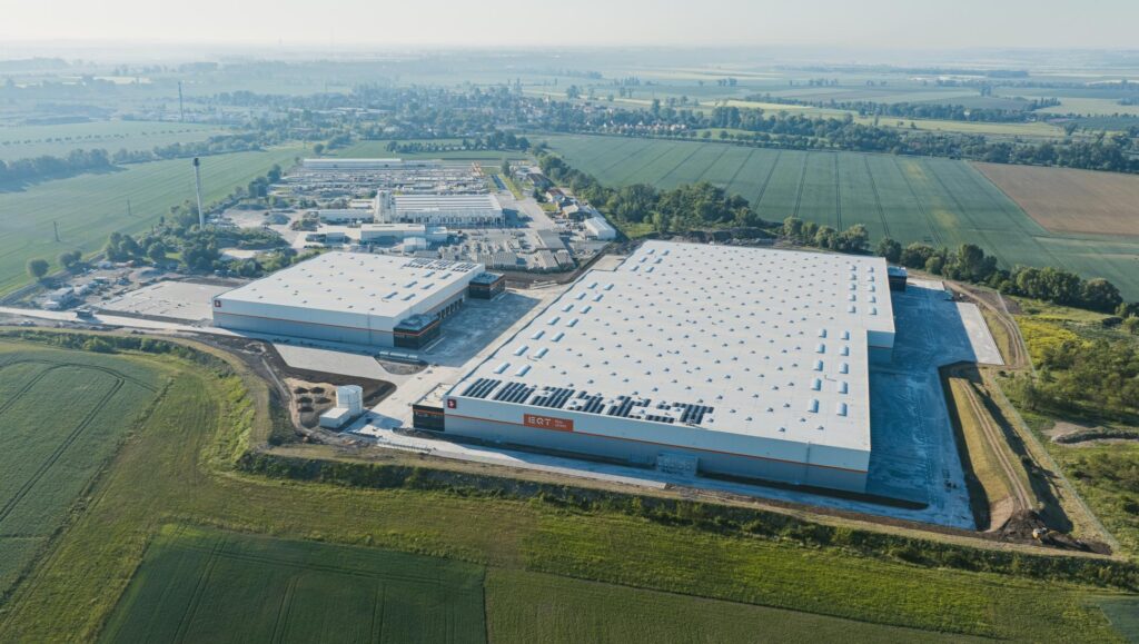
7R specializes in providing innovative and environmentally friendly warehouse and production space. The rapid growth of our business is evidenced by the fact that we are one of the leading companies among the fastest-growing commercial real estate firms in Poland. In 2021 alone, we delivered nearly 400,000 square meters of space, and this year we plan to deliver 1 million square meters. We also need to communicate the increasingly advanced products we offer our clients in a more modern way, both visually and through our messaging. For this reason, we have rebranded to focus on delivering the best customer experience.
Over the past few years, the warehouse market has evolved at an unprecedented pace. New opportunities have opened up for warehouse developers, investors, and tenants due to the sector’s expansion, as well as new technologies, growing environmental concerns, and the need for process optimization. The decision to refresh the 7R brand stems both from the company’s rapid growth and the need to clearly demonstrate that concepts such as innovation and ESG are central to our strategy. Additionally, and obviously, as time passes and the market undergoes constant change, every brand needs to be redefined, adapted, and refreshed.
We took a holistic approach to the rebranding of 7R, paying close attention to every detail of how we present ourselves. Our goal was to create a modern and distinctive branding system that would provide the best possible experience for everyone who encountered it.
A clean, minimalist design
What has changed? We created an additional version of the 7R logo featuring a light, modern, and linear design. The new element is our tagline, “Future.Log.On.” It positions our brand and complements the rest of the 7R logo. The “Future.Log.On.” tagline invites clients to log on to the futuristic world of 7R and stay with us for the long term. It is a sign that we are building here and now, and that we are also thinking about the future and the long-term value of our projects.
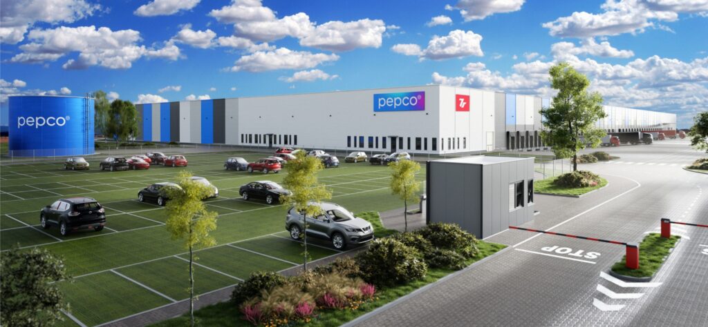
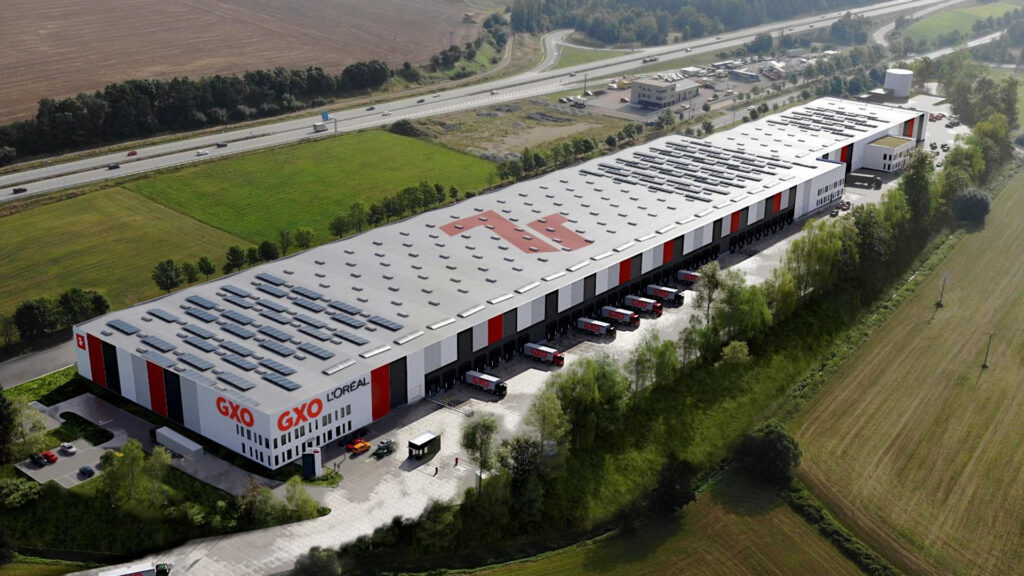
Another key element in the visual design of our brand was the more prominent display of the distinctive façade of a 7R building—the combination of red, white, and gray in a vertically aligned rectangle. Our warehouse façades are a recognizable part of our company, so we sought to integrate their design into our new, refreshed identity. The final key consideration for the refresh of the logo’s visual design was the typography. We chose to use the Lato typeface for the 7R logo, a copyrighted Polish font designed by Łukasz Dziedzic. It is a unified typeface with many variants that allowed us to create a strong and clear verbal and visual message.
We also brightened the color palette but kept the vibrant red as the dominant hue to symbolize our energy and dynamism. This color contrasts with the light grays and white. Other new elements include photographs of our products, new maps, and custom icons, all of which are designed to ensure the best experience for those learning about our warehouse products and the 7R brand.